I’ve added a new data set.

See Current Data for the updated main chart.
And a huge thank you to Kevin and Kamau for the shout-out on Episode 80. That made my day.
I’ve added a new data set.
See Current Data for the updated main chart.
And a huge thank you to Kevin and Kamau for the shout-out on Episode 80. That made my day.
I came late to the DWITGAOATP party, and the more I listen to the podcast, the more I learn about the Denzealot community.
After seven or eight episodes, I jumped ahead to Episode 49, Much Ado About Nothing, because I love that movie. One of my favorite scenes is when Don Pedro, played by Denzel, proposes to Beatrice, played by Emma Thompson. She politely declines, saying, “No, my lord, unless I might have another for working days. Your Grace is too costly to wear every day.”
Anyhow …
During the episode, Kamau and Kevin talk a lot about Liz, who maintains the @Denzealots Twitter account, and Igor Rusinov, who maintains Denzealots.com. I never realized before today that those are fan accounts. Their sites complement the DWITGAOATP podcast nicely, and I rely on them quite a bit.
Check out the Current Data. It’s starting to take shape. And please be sure to submit your ideas for visualizing the data. I’d appreciate some new perspectives.
I was three days into this project when I realized that I’m going to have to start thinking like a researcher. Which is a bit of a challenge for me, because, well, I’m not a researcher.
There are holes in my data that need fixing. For example, I listened to the first seven episodes without the intention of gathering data, so my list of Denzelisms is largely from memory.
Back to Episode 2: The Equalizer.
Here’s the starting list of Denzelisms from that episode:
In future episodes they added:
Below is the updated chart (also see the latest table on which it is based):

I changed the bar chart to a clustered bar chart, which will allow for automatic reporting of average film ratings and Denzelims. I haven’t added a key yet, but the blue bars represent the ratings, and the orange bars represent the number of Denzelisms reported by Kevin and Kamau.
And just as a side note, my spell check isn’t offering to add “Denzelism” to my spell check dictionary. WTF?

In this first chart, the bars represent the average rating given to each film by Kamau, Kevin, and their guests (if any). The final chart will look similar to this, but in addition to displaying the average ratings, the color of each bar will represent the film’s Denzelishness.
In the example below, the bar for “Glory” is a deep red, which will be reserved for films where Mr. Washington displayed his most Denzelishness. More on that to come.
See the table of data on which this chart is based. Note that the Denzelisms are incomplete. I’ll add more of that data as I listen to the podcasts. (So far I’m capturing the walk, lip, speech, and stutter. I’ll add columns for any others I catch in the podcasts.)
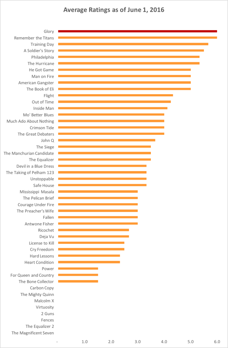
Denzel Washington Is the Greatest Actor of All Time Period started in November 2014, and Episode 79 was just released yesterday, June 1, 2016.
As of this writing, I’m on Episode 8, so my data and I are very behind. My goal is to prepare a few simple charts that capture the data Kamau and Kevin are generating: their ratings of and the Denzelishness portrayed in all the films.
I have reviewed the episode information on Denzealots.com to record the ratings. I’ll have to listen to every podcast to capture the Denzelisms that Kamau and Kevin have noted for each film.
Comments and suggestions are always welcome, especially if you have ideas on presenting the data another way. (No pie chart suggestions, please. Pie charts are evil.)
Welcome to Denzealot Data, where you can view in chart and graph form the data from the greatest podcast of all time, Denzel Washington Is the Greatest Actor of All Time Period, with Kevin Avery and W. Kamau Bell.
I’m a big fan of the podcast, and I’m an even bigger fan of Cole Nussbaumer Knaflic, author of Storytelling With Data (the blog and the book). So the next logical step for me was to start working with the data from DWITGAOATP to get it an easy-to-view format.
Comments and suggestions are welcome.
(To view a chart or graph in a larger size, click on the relevant post’s title.)